A STYLISH NEW HOME
Custom made rugs adorning polished concrete floors. Bold, contrasting colour schemes. From the minute you step out of the lift of the McCabes Lawyers Sydney office, you know this is a firm of style.
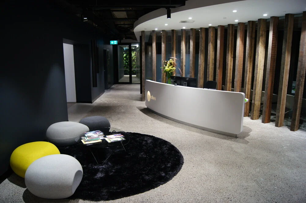
Exposed beams, matt charcoal and polished concrete. It doesn’t automatically scream law firm. But that is what greets you on level 38 of the MLC centre, the new digs of Sydney law firm McCabes.
“The brief was to create a space that reflected our brand, and defined who we are as a firm,” said Trent Le Breton, Principal at McCabes and the man tasked with overseeing the design.
“We wanted an environment for a confident, young firm that isn’t afraid to look at things differently, and that doesn’t feel constrained by market perception of how your typical law firm should look and feel.”
So far as briefs go, Le Breton nailed it. The masculinity of exposed beams and polished concrete, gives an urban edge to the reception area. It does make you feel like you are prepared to win the fight, whatever your legal battle might be.
The use of charcoal matt paint, low pendant lights and the short seating draw the eye out to the spectacular Sydney views that the MLC Centre is renowned for.
Pops of colour – yellow and orange, create contrast, giving a youthful, original vibe and creating warmth and comfort in what could be mistaken for a large warehouse.
Raw, unpolished timber and floor-to-ceiling glass form a semi see-through, double curved wall behind the reception desk and is the shared wall with the boardroom.
Reception desk
“McCabes loved the concept from our first pitch for the project [of the double curved wall] to lead visitors into the heart of the reception zone and enjoy the views whilst telling a story about who McCabes are; they are comfortable to be other than mainstream but are made of 'sturdy material'”. Says Robert Brewer, managing director of Designate Projects, the corporate fit out and design company engaged by McCabes to breathe new life into the building
“Procurement of these very old timbers was difficult and high risk for a very fast track office fit-out. The prototype had to work, and in my view does the job admirably.” Says Brewer.
Leading off the main ‘front of house’ reception area are a series of meeting places and boardrooms. They have a clever position to get the most from the buildings hexagonal floor plan, create privacy and allow for free flow gatherings to take place.
“The design presented an opportunity to show the youthful and bold nature of McCabes culture to their clients, whilst addressing the demanding logistics of multiple meetings, for differing numbers of people and duration.” Says Brewer.
A visitor’s refreshment area, tucked away near the second boardroom, is as appealing as it is functional. Shinny black cupboards, island bench and low hung pendant lights makes the area look like an upmarket city apartment.
The main boardroom space can serve as one open room or separated in two with the use of operable walls, complete with video presentation facilities and a view of the CBD’s west and beyond.
Continue along the hallway and a large industrial sized glass door, frames a green wall, enticing you forward.
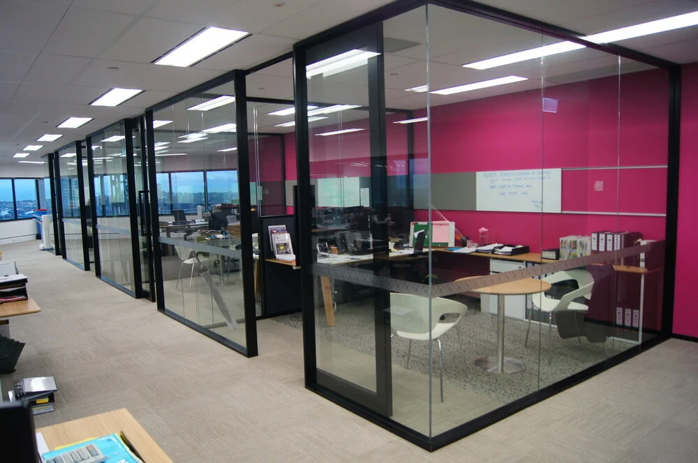
And surprisingly, on the other side of the green wall, it is open plan, with glass offices encasing the middle of the room.
“We came from an office intensive environment, which didn’t fit with two of our key values; promoting team work and focusing on continuous improvement.” Said Le Breton.
“We wanted to create an open environment that would encourage collaboration; a space where our young lawyers could be mentored more effectively.”
Internal offices, level 37
White outer walls and the pale wooden desks provide the perfect subtlety to frame the windows, which serve almost as bespoke art.
Again, pops of colour from ottoman stools and a bright bold colour palette on the centre walls create contrast and encourage stimulation.
“The predominant colours in the fit-out are generally earth and timber, with bold contrasts between white and charcoal.
“The bright colours are introduced as a foil to the rest. A bold and light hearted expression of the McCabes team, based on the McCabes corporate colours,” says Brewer on the colour scheme.
By having the principal’s offices and break out rooms around the core of the building, natural light is maximised and all staff are able to enjoy the views; two important elements when creating an egalitarian approach to a work environment.
Traditionally, paper heavy law firms have steered clear of open plan spaces. The tendency for paper mess becomes cluttering and distracting, though this doesn’t seem to be an issue at McCabes.
“The key to this was to encourage staff to change their work practices and become less reliant on paper. Technology has come so far in recent years that we just don’t need the number of physical files that we once did.” Said Le Breton.
“We did get some strange looks when we informed our lawyers, particularly our litigators that we would have around 50% less storage at the new premises. The transition has been amazingly smooth.”
A steel internal staircase, leading to level 37, continues the open collaborative theme McCabes has embraced. Walking down the stairs, the sight of the delicate white outer floor space and bold pink inner walls, reinforce that a lot of thought has gone into this design and colour scheme.
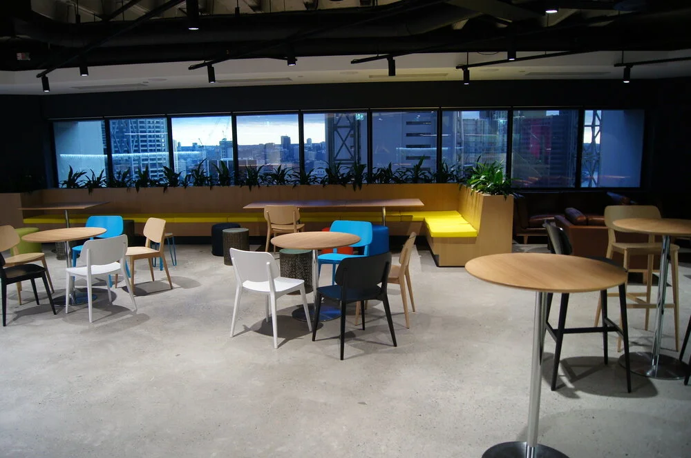
The staff breakout area; a 130 square metre space, resembling a funky, inner city café but with the size you would expect to find in a warehouse, is the feature of level 37.
“It was important for us to give staff the space to socialise and interact away from their desks,” says Andrew Lacey, Principal and head of the litigation and dispute resolution team.
“We wanted to create an area that is not only stylish and young, but also practical.
“The breakout area also serves as a space to host internal training and seminars as an alternative to the board room.”
Staff break-out area, level 37
A mix of café style seating, long benches and home-style leather lounges, provide staff a complete mind break and captures the young essence McCabes has built. Shiny black cabinetry, high ceilings and polished concrete floors repeat the solid industrial style of reception, and remind the viewer that this is not an ordinary law firm.
“We are different. We are not a large multi-national firm and we don’t pretend to be. We are proudly Australian based and in control of every aspect of our business, which is a large part of our success,” says Principal Andrew Lacey.
So far as office fit outs go McCabes have done a lot with their space. They have captured and created a working vibe that exudes success. Add this to the convenience and status of the Martin Place location, and this is one firm that will continue to stand out from the rest.


